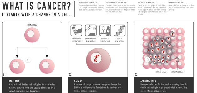
The Visual.ly Health Data Visualization Contest is over and the vote is in! If you missed it, rest easy — there will be more Visual.ly contests! Without further ado, here are the winners: 1. Dana Ng squeaked into first place with this great static infographic about cancer: Cancer Anyone? The graphic tells a great story, has a good flow, and overall high quality graphic design. Dana will receive a license for Tableau Desktop, a ticket to Strata Conference + Hadoop World, and $500 to help with travel expenses for the conference.
2. Missing first by just one point, Susie Lu and Anson Chu put together a great interactive (with some chart advice from Bob Monteverde) on USA Health Care Reform and Spending. They will win $200 towards an ebook reader of their choice.
3. Third was also just one point behind. Chris Nabors put together a great interactive (aside from the initial donut charts with too many sections) about US Natality. Chris gets a signed copy of I Love Charts: The Book by Jason Oberholtzer, as well as a copy of Show Me How by Derek Fagerstrom and Lauren Smith, and Listomania curated by Mariah Bear.
4. Fourth was also a close one, and does a really great job with data analysis. Stephanie Vatz created an interactive map detailing America’s Worst Nursing Homes. To recognize the great data work that Stephanie did, Strata has thrown in a bonus prize: Stephanie will receive a pass to the new Strata Rx Conference.
5. Terri Bleeker seems to be a track fan with her infographic covering Youth Track Injuries
6. Bulat Beksultanov unfortunately used a radial bar chart, but otherwise created a great graphic about Sexually Transmitted Disease Morbidity.
7. Mamta Chudasama and Shantanu Dixit created an infographic that does a good job of telling a story about Community Health Status.
8. Vivekanandan Mathivanan created a good static infographic on Healthy Aging.
9. Ralph Lin loves stacked area charts and used three of them in Off Label Drug Use.
10. Manya Gupta took an icon approach to US Health Care Expenditures.
There were lots of great submissions, and plenty of good visualization work went into these. Ranking the submissions was a difficult job and there were some contentions among the judges, showing how different qualities of a visualization can all be important. Keep your eye out for the next Visual.ly contest, we’ve got some great ideas brewing!


