
The Product Demo template lets you create an engaging, guided tour of your product with interactive tooltips and supporting content sections. Visitors can explore your product step by step, reveal key information, and finish with a clear call to action—making it an ideal choice for product education, onboarding, or lead generation.
Here’s how to set it up and customize it for your content:
What is the Product Demo Template?
The Product Demo template is an immersive, interactive walkthrough that highlights your product’s features in an intuitive and engaging way:
- Tooltip-Driven Tour: Upload a product image and add interactive tooltips that display small info boxes with explanatory text. Each tooltip includes a Next button, guiding users through the demo in a structured flow.
- Guided Completion Screen: At the end of the flow, visitors reach a dedicated results page with your CTA message and button, encouraging them to take the next step.
- Additional Content Sections, the template also includes:
- Accordion for FAQs or feature breakdowns
- Image + Text blocks for visual storytelling
- Form section for lead capture or newsletter signup
Step-by-Step Guide to Using the Template
Add Your Product Visual
- Upload a screenshot, UI mockup, or product image. With the image selected, click on the smaller version on the right side of the panel and once the popup box appears, click on “Reselect Image”:

The current New Creative screen provides template, complexity, industry, and use-case filters. - You can also create a new library category, just click on “Add Category”, name it and drag and drop your images into the box.
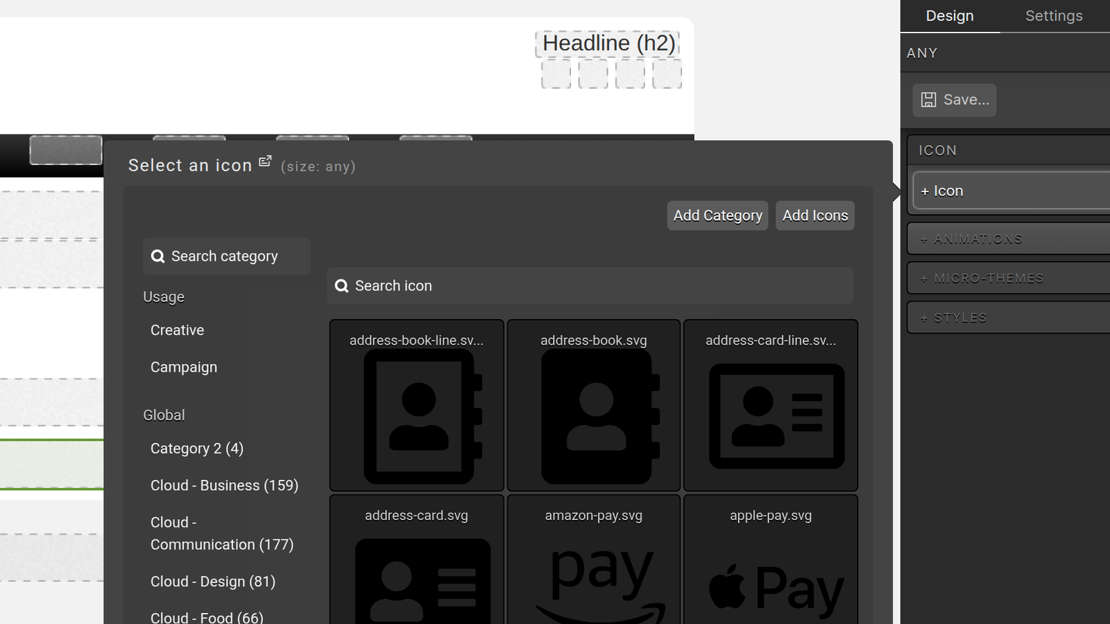
The current icon selector provides searchable global, campaign, and creative icon categories. - This template has show/hide features, with the tooltip containers showing up below the image on smaller screens, make sure to also change them. Change your viewport to XS and update your content.
The current Reveal component supports overlay or toggle behavior and click or hover triggers.
Customize Tooltip Position
- Using the Element Layers tab on the left side of the Creative Studio, select the item “Reveal”.
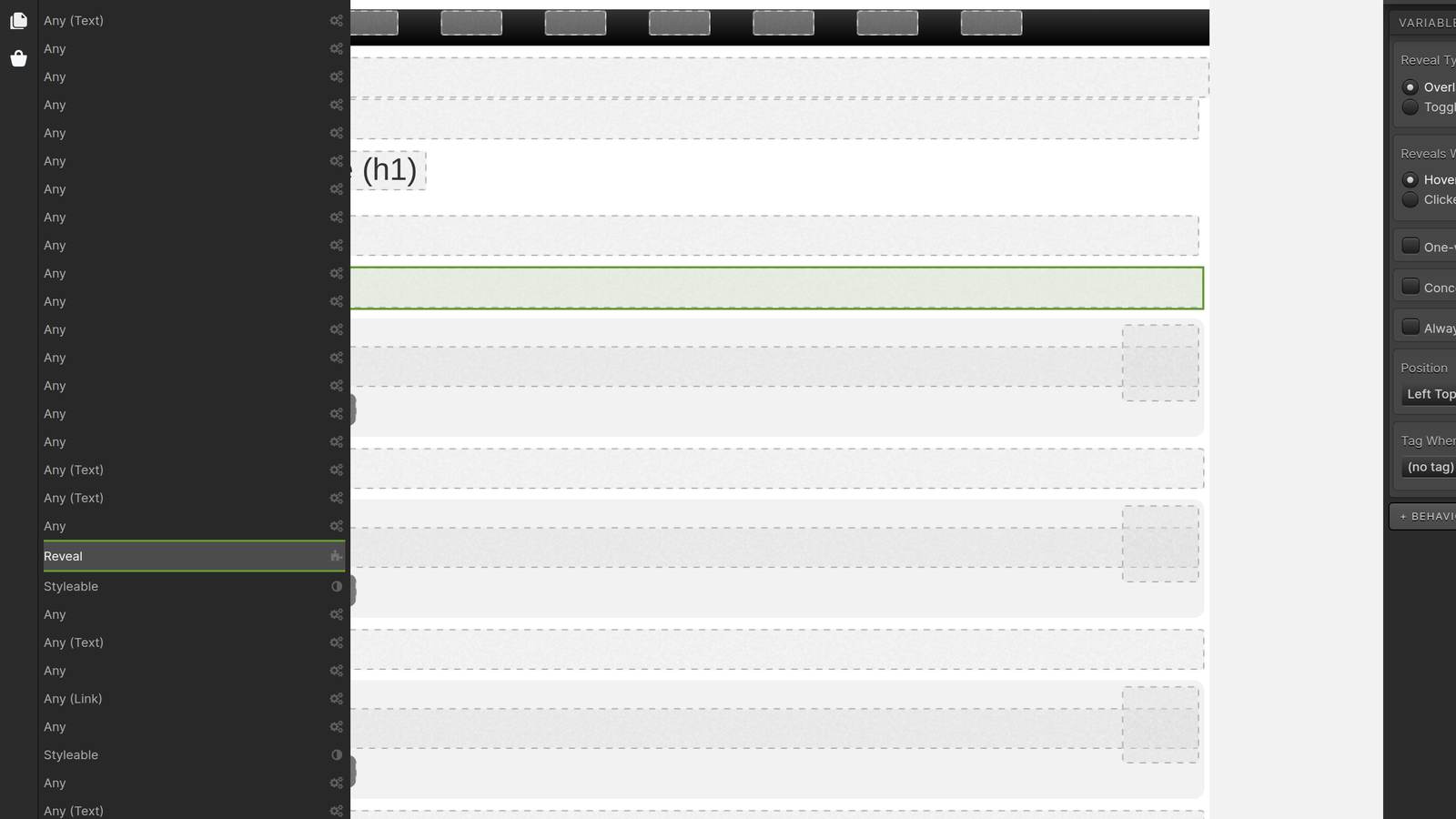
Use Layers to inspect and select nested page elements. - Once selected, on the right side of the Creative Studio, change the tab from Settings to Design and open the Layout accordion under the Styles section.
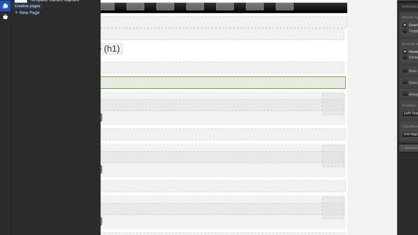
Use Pages to navigate or add pages within the creative. - Scroll down to Position and adjust the location of your tooltip according to your liking.
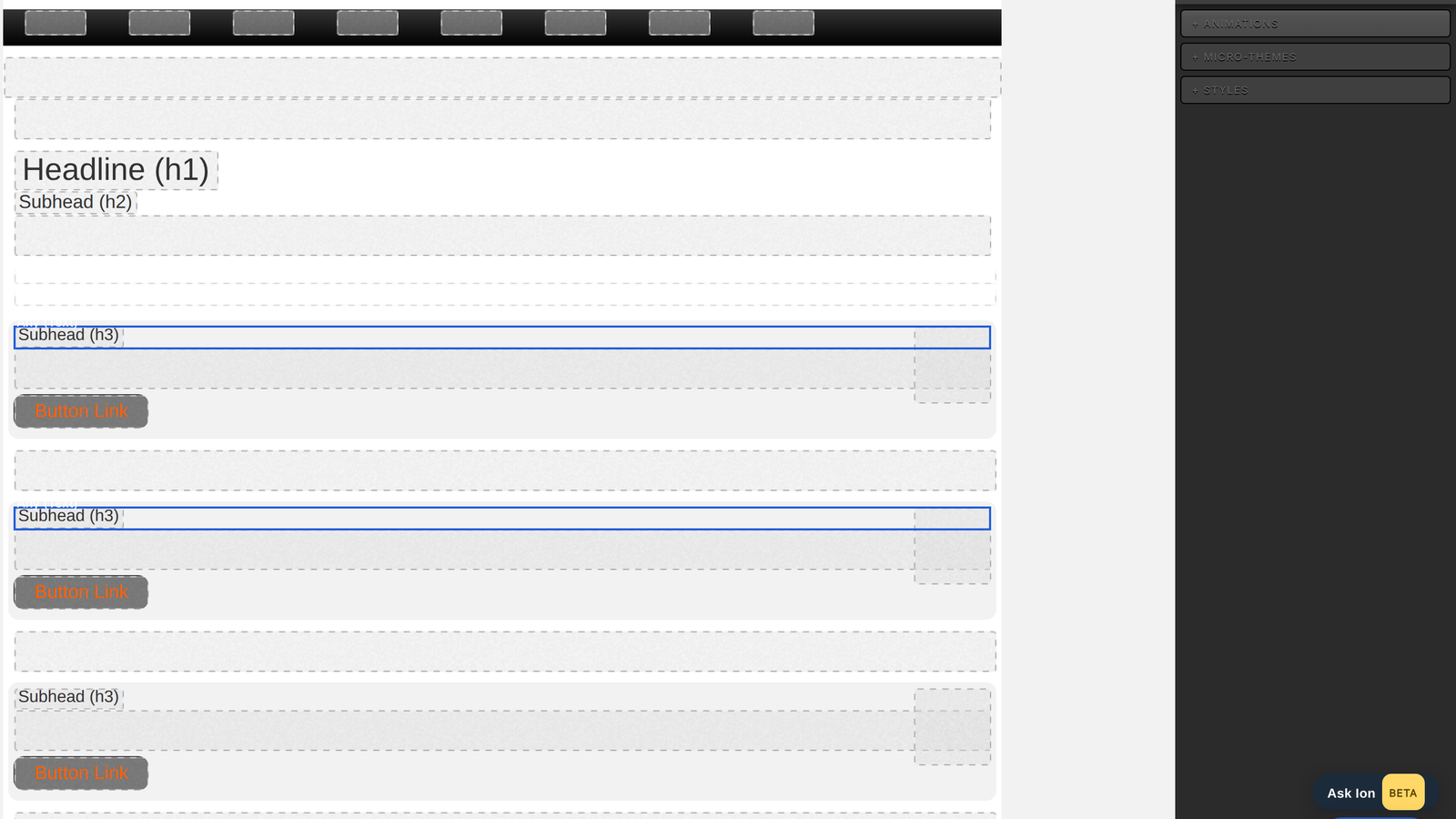
Creative Studio provides Design, Settings, Page rules, Layers, Pages, Preview, and Tag Map controls. - Use Preview to better check the position on all viewports.
Set Up Supporting Sections
- Use the accordion for FAQs or additional context.
- Add images and supporting text to highlight use cases or success stories.
Test and Publish
Preview the walkthrough to confirm that tooltips display correctly, flows run in the right order, and the CTA screen works as intended. Be sure to test accordion interactions, text formatting, and form submissions to ensure a seamless experience across devices. Once everything looks polished, your product demo is ready to publish and share with your audience.
